This post may contain affiliate links, which means that we make a small commission off items you purchase at no additional cost to you. Please refer to our Privacy Policy for more information on how we may use your information.
If you have taken any notice of paint color trends in the last several years, you likely have seen that color, and specifically loud color, has been on trend. Whether it’s mudroom cabinetry, kitchen islands, decor, or entire rooms, color is having its moment. We have tested out our fair share of statement colors and neutrals with some hits and some misses along the way. Let’s explore the hits, and how to make sure it’s a hit.
All selections are Sherwin Williams for ease! You’ll notice we reference LRV throughout this article. If you are unfamiliar with that term, LRV means a color’s light reflectivity value. Each paint color is assigned a number value between 0-100. The whitest white would be a 0 and a true black would be a 100. This value helps you assess how light or dark a color will be. If you are trying to brighten a space that does not have a lot of light, you may want to choose a color with a high LRV. If you are going for dark and dramatic, choose a color with a lower LRV.
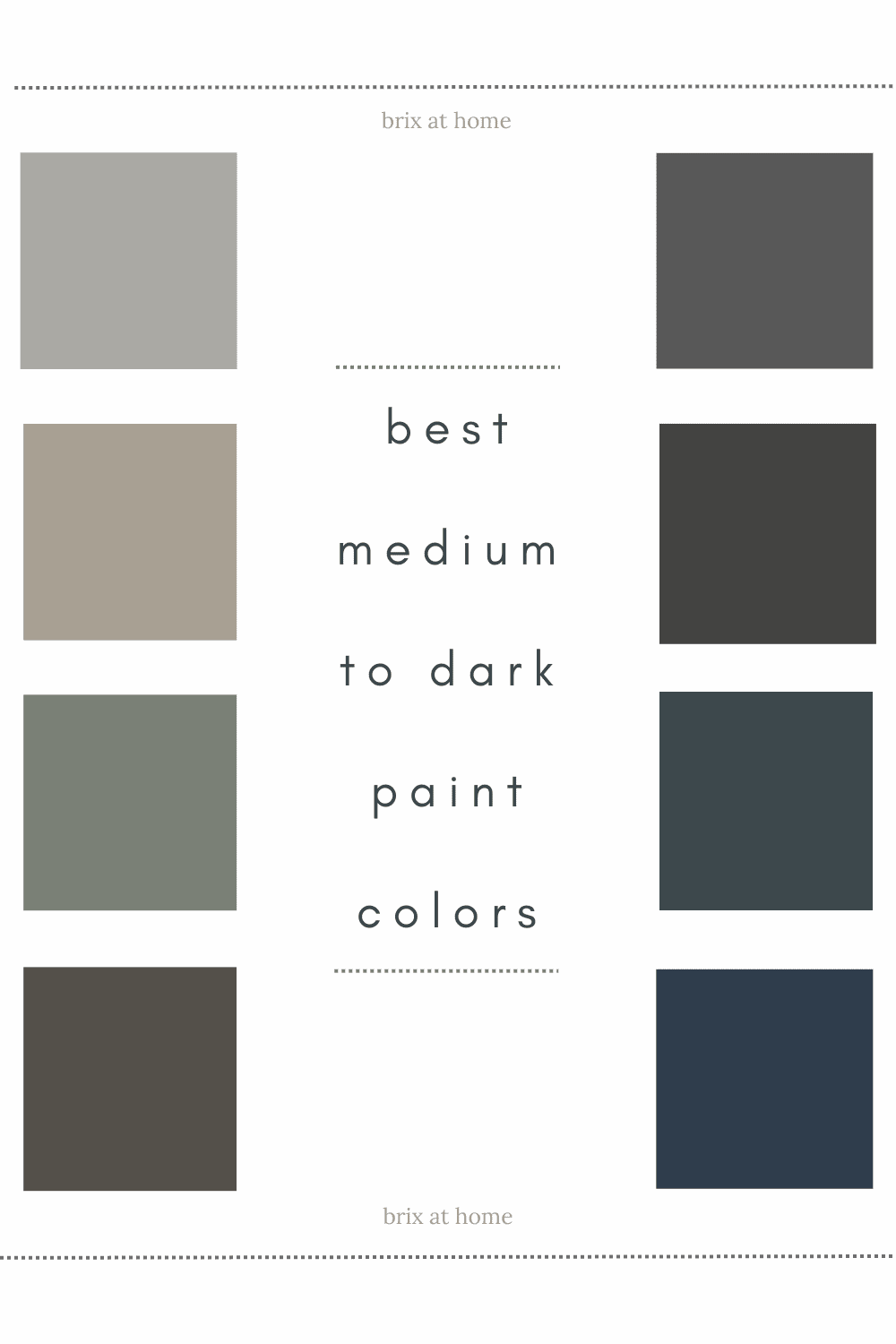
Best Neutral Dark Colors:
For our first choice on the dark end of the spectrum (LRV 10) we love Peppercorn SW 7674. Peppercorn is an extremely versatile color. It can easily be used for cabinets, wall color, and exterior- such as front door, garage door, or shutters. If using on cabinets, it definitely needs to be sampled next to your tile, countertops and wall color as it can take on surprising undertones. While it pairs well with most hardware finishes, we love it best with polished nickel or brass tones.

If your space utilizes warm tones, Urbane Bronze SW 7048 (LRV 8) is a solid choice. We have used it for a baby girl’s nursery, kitchen accent wall, interior door color, exterior color, cabinet color, and more. It works in both neutral and contemporary design. While it pairs well with any hardware finish, we love it best with gold and brass tones.

If Urbane Bronze feels a bit too dark, but you want an elegant earthy feel, Anonymous SW 7046 is another go-to pick. With an LRV of 20, it’s on the border between a medium and dark tone. Anonymous is a beautiful neutral color with slight gray to green undertones that can work equally as well in traditional and contemporary designs.

Love black, but want it to be more subtle and less stark? Go with Iron Ore SW 7069. With an LRV of 6, it’s very dark but not quite black. In our opinion, Iron Ore is a true neutral that pairs beautifully with both warm and cool toned designs. Looking for moody drama? An iron ore fluted vanity and dramatic lighting in a powder room would be incredible.

Best Neutral Medium Colors:
Our preferred way of bringing elegance and drama to a room without going dark, is using a medium toned neutral. To keep it simple, we have a top warm and a top cool option for medium toned neutrals. For warm, we prefer Intellectual Gray SW 7045 (LRV 36). For cool, we prefer Ellie Gray SW 7650 (LRV 40).


Best for Bold Color:
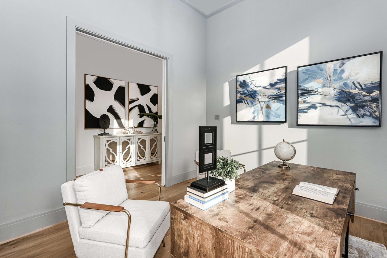
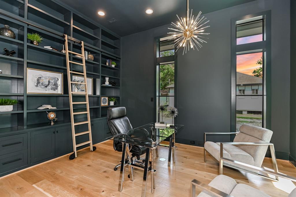
If you are looking for a bold but sophisticated choice, blue and green hues have been consistently on trend. Mount Etna SW 7625 is our top choice based on versatility and how underrated it is. You don’t see it used or mentioned frequently, but it is a quiet winner. Mount Etna can be classified as a blue, but with more than a hint of green. With an LRV of 6, it is on the dark end of the spectrum, but in our opinion 6 is a surprising value for this color. It appears a bit brighter. We have loved this color for vanities, mudrooms, and home offices. We love it so much we even painted our son’s crib Mount Etna! It can work with any finish of hardware, and works just as well with warm or cool toned accessories.

Feeling the blues? Naval SW 6244 is a rich navy that grew in popularity after being named Sherwin Williams Color of the Year in 2020. You can see it used on exteriors, kitchen cabinets, accent walls, and entire rooms. We love how it can easily be used for a sexy and sophisticated office/lounge or for a fun and playful child’s bedroom or game room. Naval has an LRV of 4. I recently had this color slated as an exterior color and thank goodness for sampling, as it would not have gone over well. Naval is fantastic and I've used it many times, but never against a white. When using Naval as a wall color, use it monochromatically for walls, trim, ceiling, and doors. If using for cabinetry, I would recommend avoiding white tile and walls surrounding it. It makes it look too blue in my opinion when used next to white.

A new find for us is Retreat SW 6207. Retreat feels well, like a retreat. It’s peaceful and calming, yet can command attention. Retreat is a green with gray undertones that feels like neutral. We have Retreat planned for an upcoming mudroom, coffee bar, and secondary bathroom vanity. We don’t love the idea of seeing this color for an entire kitchen, but would definitely consider using it for a bedroom color. With an LRV of 21, it’s the lightest of our “dark” recommendations, but it can still bring the drama.

Regardless of if you are working with a light, medium, or dark selection that is bold or neutral, coordinating trim and ceiling color is daunting. There’s a hack to this if you don’t wish to take on the task- walls, ceiling, trim, and the doors on the interior of the room should all be painted the same color. Just make sure to change the type/finish of paint you are using- typically walls will be in a flat or eggshell finish and trim/doors in a semi-gloss- your painter will be able to guide you further on the appropriate finish for walls vs. trim based on your specific space and preferences. If this is a DIY project, the paint or hardware store will definitely give guidance. Making the room monochromatic somehow does some sort of voodoo magic that takes the elegance level of your space from 50 to 100 and makes the room feel larger and more open. This is the type of hack that makes your home Instagrammable, Pinterest perfect, and ready to command top resale value for your home.
The ever present problem of looking at a freshly painted room and feeling like it just does not work and doesn’t look like your sample is caused more often than not by the paint color not pairing well with the ceiling or trim color. When a sample is done, it’s not large enough or typically extended to reach both the ceiling and trim color to see what the final effect will be. By making all paint monochromatic, you eliminate this issue and any competing undertones that may arise from using multiple colors.
Searching online for the perfect paint color has made us feel overwhelmed more often than not. While color trends seem to move quickly, there’s no need to repaint regularly to feel like you are keeping up. When it comes to paint color, appropriate use is most important. When utilizing a color for an entire room, using our monochromatic hack mentioned above is key. Beyond that, sample, sample, sample! Make sure that you are sampling on site, with all relevant players- tile, other paint colors being used, countertops, hardware finish, etc.
Need to sample without the mess, cost, and hassle of buying multiple sample cans from the store? Check out our favorite method- it’s more cost effective and can be done from your couch with no mess. You can have oversized peel and stick samples delivered to you overnight!