This post may contain affiliate links, which means that we make a small commission off items you purchase at no additional cost to you. Please refer to our Privacy Policy for more information on how we may use your information.
If you google search for best paint colors, you can find thousands of articles where each color is analyzed depending on which direction your windows face, what type of lightbulbs you have, what color countertops are installed, and it seems like even what you ate for breakfast that morning or if there’s a full moon.
For some people, this can feel like a fun mystery to solve. If you have that desire and a lot of time on your hands, then get after it! Spend time browsing the hardware store’s paint section finding color chips that speak to you. Ask your local Sherwin Williams, Benjamin Moore, etc. for a fan deck and peruse at your leisure. Once you have several colors that appeal to you, either purchase sample cans and paint samples on each wall or go with my favorite mess free option, and evaluate every couple hours of the day as the light changes. The best part of my favorite sampling method- these oversized peel and stick samples are delivered overnight, so if you are impulsive like me, you don't have to wait days to see if the idea in your head will work.
Despite my love and interest for design, I have zero desire to do this. When I first started in design, I felt like there had to be a simpler way to find colors that look appealing in every room at every time of day, whether lights are on or off. While I still absolutely recommend sampling before going for it, I have found my magic hack.
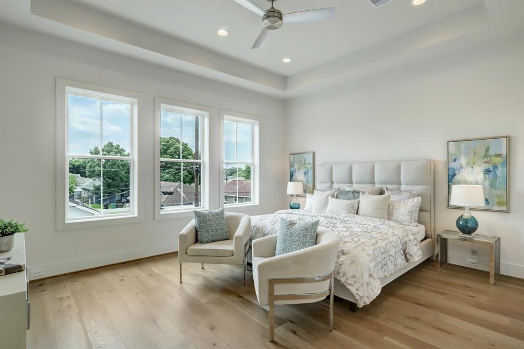
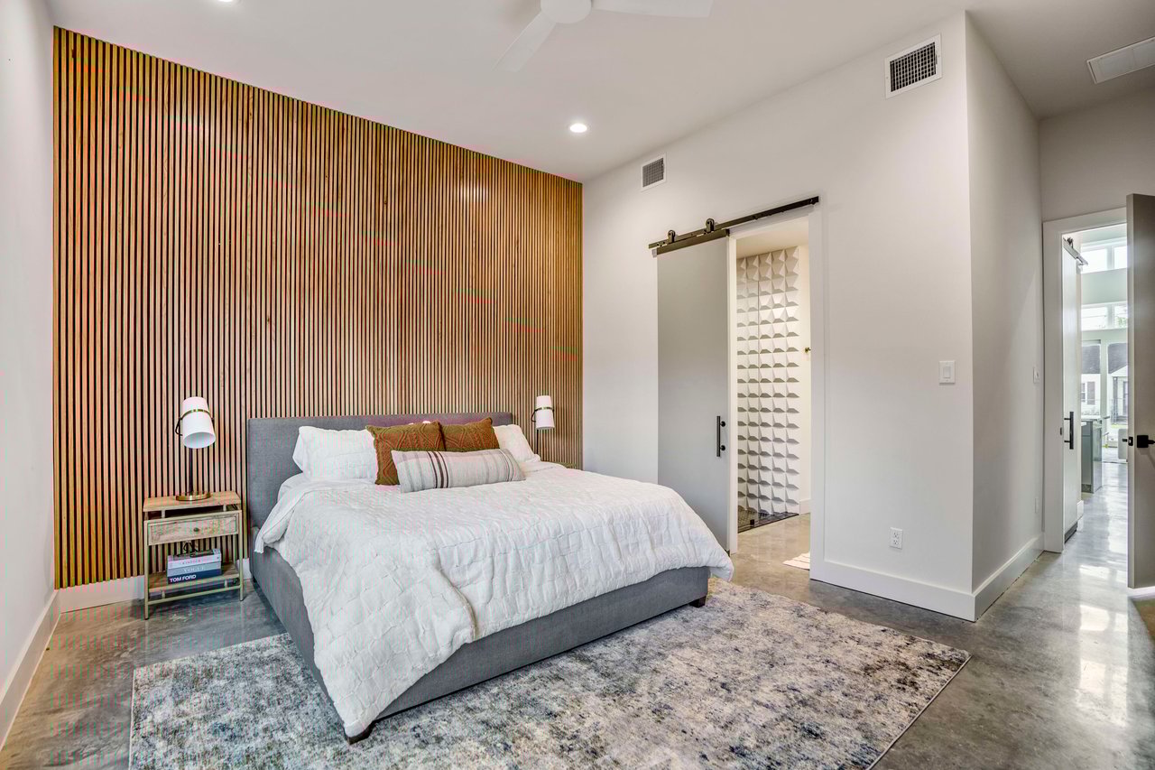
The walls, ceiling, trim, and the doors on the interior of the room will all be painted the same color. Just make sure to change the type/finish of paint you are using- typically walls will be in a flat or eggshell finish and trim/doors in a semi-gloss- your painter will be able to guide you further on the appropriate finish for walls vs. trim based on your specific space and preferences. If this is a DIY project, the paint or hardware store will definitely give guidance. Making the room monochromatic somehow does some sort of voodoo magic that takes the elegance level of your space from 50 to 100 and makes the room feel larger and more open. This is the type of hack that makes your home Instagrammable, Pinterest perfect, and ready to command top resale value for your home.
The ever present problem of looking at a freshly painted room and feeling like it just does not work and doesn’t look like your sample is caused more often than not by the paint color not pairing well with the ceiling or trim color. When a sample is done, it’s not large enough or typically extended to reach both the ceiling and trim color to see what the final effect will be. By making all paint monochromatic, you eliminate this issue and any competing undertones that may arise from using multiple colors.
Just remain mindful of other finishes that may be up against your paint such as tile or cabinets. If you have concerns, make sure your samples are up against the area of concern and large enough to evaluate what the final look will be. This is where my favorite peel and stick samples can come in handy.
You’ll notice we reference LRV throughout this article. If you are unfamiliar with that term, LRV means a color’s light reflectivity value. Each paint color is assigned a number value between 0-100. The whitest white would be a 0 and a true black would be a 100. This value helps you assess how light or dark a color will be. If you are trying to brighten a space that does not have a lot of light, you may want to choose a color with a high LRV. If you are going for dark and dramatic, choose a color with a lower LRV.
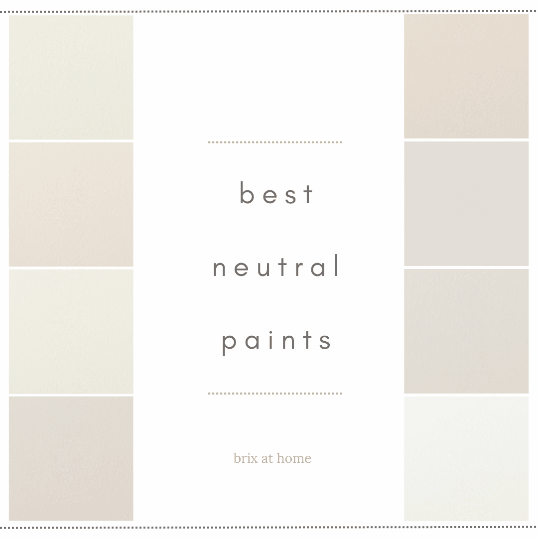
Let’s finally get started with light neutrals that I have had success using either in a single room or for a whole house color.
Starting with the lightest, or highest on the LRV scale with Benjamin Moore Chantilly Lace OC-65 with an LRV of 90. This is about the highest on the LRV scale that I recommend for a whole house color to not be stark or blinding, unless it’s an ultra contemporary home and a stark white fits the vibe. Chantilly Lace is bright and inviting. It can easily be used as a white for cabinets and work in any style of home.

Moving to the low to mid 80 range of the LRV scale, we will quickly discuss three Benjamin Moore Best Sellers that are easy go-to neutral recommendations. The lightest of which is Benjamin Moore Cloud White OC-130 with an LRV of 85. It’s an excellent option if you are wanting something that comes off as white but feels soft. Next with an LRV of 83 is Benjamin Moore White Dove OC-17. This best seller clean and classic and leans just a hint cooler than the other two mentioned in this section. Benjamin Moore Swiss Coffee OC-45 (LRV 82) has gained popularity in recent years due to a lot of influencer mentions and with right reason. It’s an elegantly soft off-white. I love using Swiss Coffee for a kitchen cabinet color with my monochromatic hack on the walls, ceiling, and trim. Stunningly soft and effortless.


One of my go-to Sherwin Williams off-whites is Creamy SW 7012. It has an LRV of 81, making it feel bright but not boring or stark. It can feel yellow depending on the trim and ceiling color used, so it is absolutely another color to use monochromatically for best results.

For a warm toned feel that is on the cusp between off-white and beige, Moderate White SW 6140 (LRV 74) would be my pick. It’s a beautiful selection for main living areas. I love to see it with medium to dark stained furniture and cabinetry.

Sherwin Williams Aesthetic White SW 7035 has been a long time best seller and designer favorite. It has an LRV of 73 and can be considered a light “greige” with a warm feel. I would not recommend Aesthetic White to be used with cool colored decor and finishes. Eider White SW 7014 also has an LRV of 73 and can be used with either warm or cool colored decor and finishes, as long as it is used monochromatically across walls and trims. I personally feel that Eider White is the most underrated Sherwin Williams color, and it has been my go-to for spec homes for years. I feel it is underrated due to difficulty in finding a trim/ceiling color that does not bring out any funky undertones of Eider White. Using if monochromatically eliminates that issue and makes Eider White my top choice for an elegant and inviting feel.


If gray is your thing and the feel you are going for throughout a home, there are two warm leaning grays that I utilize often. If your space is needing a lighter feel, Benjamin Moore Classic Gray 1548 has an LRV of 74 and can be a beautiful complement to any style of home. I have not encountered many issues using Classic Gray alongside a true white cabinet or tile, which makes it an easy recommendation.

Want a bit more of a moody, cozy feel? Sherwin Williams Repose Gray SW 7015 (LRV 58) has been one of their hit paint colors for years for good reason. Warm and soothing with an elegant feel, we also love Repose Gray for a cabinet or door color. I love using Repose Gray lightened by 50% throughout a whole home.

Well this wraps up yet another lengthy designer paint color article. I hope that this has been helpful in reassuring that there is a way to make this process simple and easy that doesn’t leave you with regrets after the project is finished. Let us know your thoughts if you try the monochromatic hack!